I’ve waffled a bit on the control panel art, trying to decide if it was a little “much”. After all, one of my design goals was to be relatively conservative. That’s why I’m going to be staining the cabinet to match the rest of the furniture I have in that room, and keeping it largely toned down.
I wanted to get a rough sense of what the art would look like on the cabinet, so I fired up Gimp and did some cutting and pasting and perspective skewing. Through the magic of layers and editing, I got a reasonable result, I think.
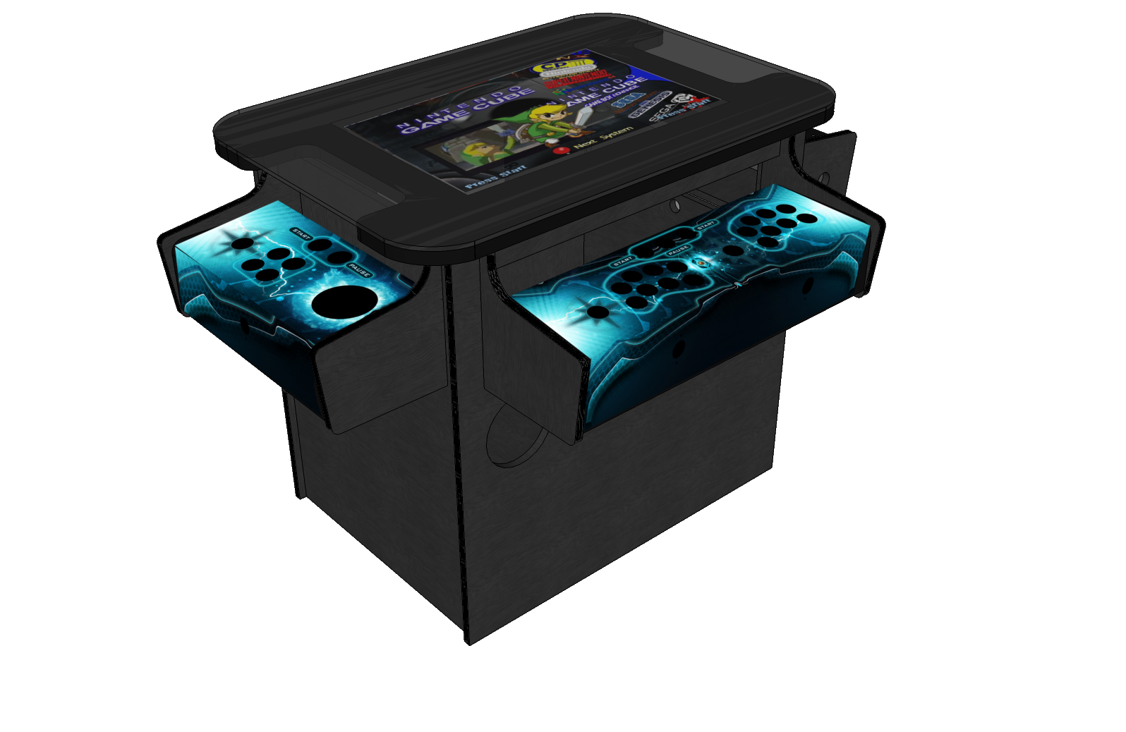
Generally speaking, I’m pretty happy with it. Its definitely not conservative, but its got a nice look. It won’t be conservative when all the buttons start lighting up, anyway.